
“I follow your work and I love it. I am very visual, but I am not very good at drawing. Still, I think mediations could be better if we can learn how to incorporate visuals like your mediation agenda … it is so beautiful!” wrote Maria, a mediator who appreciated the power of working visually, but didn’t feel comfortable doing it herself.
What prevents most dispute resolution professionals from working visually with parties is the belief that they need to be able to make whatever goes on the page look good. In some types of business meetings where visual mapping occurs there is definitely a need and a reason to create beautiful maps. However, in mediation quite the opposite is true. As I discovered when I applied my visual communication skills to situations where disputes are being resolved, it’s actually more effective when your maps look BAD.
This is awesome news for everyone who worries they can’t draw, that their writing never comes out on a straight line, or that they perform even worse when they have to write things live in front of their clients. When you do pick up a marker and map things out together, both parties increase the quality of their discussion as co-creators of a visual. Information the mediator captures is meant to shine light on each of their perspectives, their shared interests and options generated, thereby leading to better communication and creative problem solving. Beyond making the words legible, the aesthetics are the last thing you need to be concerned about.
So, why is it better when the information you capture looks bad?
1) The purpose of the visual is to help people better process what’s been said, not to entertain them with your artistic talents. Think of your visuals as working notes, not a piece of art. It’s not about YOU…the focus is on helping the parties.
2) You are not looking to memorialize the conflict. When people leave mediation, the idea is for them to move forward from the conversation that took place. These notes most often will be left in the past, or possibly destroyed confidentially. In most scenarios, you don’t want to create something so beautiful that people view it as a treasure and continue to commune with it.
3) If it’s beautiful, the visual creates a force field. Especially where problem solving is happening and various ideas are being heard, you want parties to feel free to correct and change the map, making additions or deletions as necessary, and you don’t want anyone to feel like they are wrecking your creation. Messy, imperfectly scribed/drawn things appeal to the human eye, and when you create rough, raw working notes, people feel freer to contribute to or change them.
 When working visually in mediation, it’s important to introduce the process to everyone in the room and explain exactly why you’re using the medium. Discuss the norms for working visually and be sure to specify that the map belongs to the parties, not you, emphasizing that they are co-creators, not spectators. The goal is to make them feel comfortable giving you feedback/correcting what’s written on the map to ensure the meaning being made is accurately reflected.
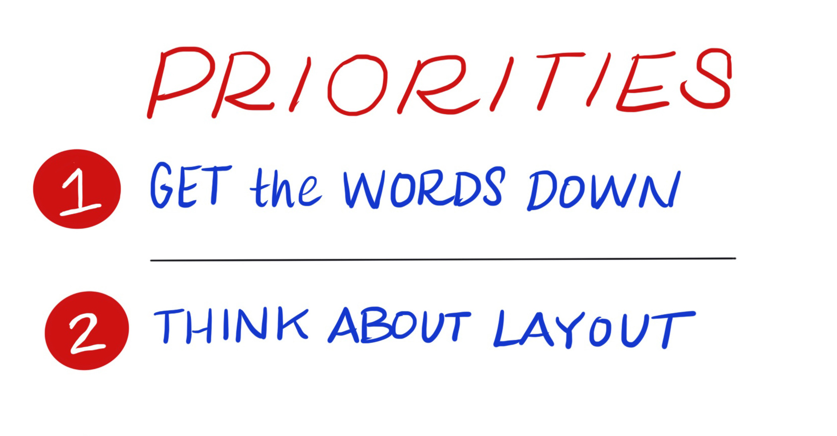
In these live situations where discussions are happening as you visually map it, priority 1 is to get the ideas/words down. Once words have been spoken and the conversation moves on, you won’t get the opportunity back to capture it, so it’s vital to focus on getting the words on the page quickly and somewhat legibly, not worrying about how pretty they are or not. Priority 2 is organizing the content on the page in a way that makes sense and adds meaning to the conversation. The point of visuals in mediation is to enhance the discussion in a way that provides clarity, establishes understanding, and outlines the conflict and potential solutions. The aesthetic/how the information looks is the absolute lowest priority.![]() Save your concern for aesthetics for when you are not working live. These are times when things can look good (but still don’t have to in order to be effective). Things like information graphics created to explain the process of working together to clients (i.e., a defined set of known content, visualized ahead of time), or a graphic template created to guide and capture certain predictable segments of a mediation dialogue to provide added clarity and foster understanding between parties (like the one Maria refers to in her email) are ones where you can use more artistic effort to make them appealing. Still, remember that stick figures and scribbles on the backs of paper napkins have worked perfectly to convey meaning for a long time!
Save your concern for aesthetics for when you are not working live. These are times when things can look good (but still don’t have to in order to be effective). Things like information graphics created to explain the process of working together to clients (i.e., a defined set of known content, visualized ahead of time), or a graphic template created to guide and capture certain predictable segments of a mediation dialogue to provide added clarity and foster understanding between parties (like the one Maria refers to in her email) are ones where you can use more artistic effort to make them appealing. Still, remember that stick figures and scribbles on the backs of paper napkins have worked perfectly to convey meaning for a long time!
In some scenarios, it may be useful to create a new visual after a mediation to display the agreements parties came to in order to serve as a reminder of what was decided. For instance, Susanne van der Meer, a lawyer and mediator who specializes in creating visual contracts, went through her own divorce mediation. When it was all over, she created a visual parenting plan to summarize the agreements and schedule they had come to and made copies to hang on the fridge so both the parents and the children could see what the parenting rules were. This gave everyone involved a clear picture of what was happening and an easy reference to use when questions arose. Kudos to Susanne for this brilliant, very practical application.
If you’re interested in bringing visuals into your own mediation practice, I’ve got a great, FREE 3-part training series that you can use to learn how to harness the power of visual communication and take your practice to the next level. Check it out here.
Comments